Capital Electric Cooperative
Brand Identity
The Challenge
Capital Electric Cooperative (CEC) is a trusted energy provider, with service to more than 18,000 homes and businesses in central North Dakota. With a new headquarters on the horizon, CEC wanted to enter their next chapter with an updated brand identity that was a better reflection of the cooperative, their values, and their vision for the future. As a long-standing, integral member of the community there was no margin of error – we knew we had to get it right.

Our Solution
We began the process by facilitating a brand workshop with the CEC leadership team. Through a series of exercises, the group identified character attributes and archetypes found within their organization and demonstrated by their team on a daily basis. Our brand strategists used these attributes and archetypes to craft a brand persona that was used as the foundation and guiding principle behind the new visual identity. The “can do, kind-of-guy” persona portrays CEC’s reliability, genuine nature, and willingness to get the job done.
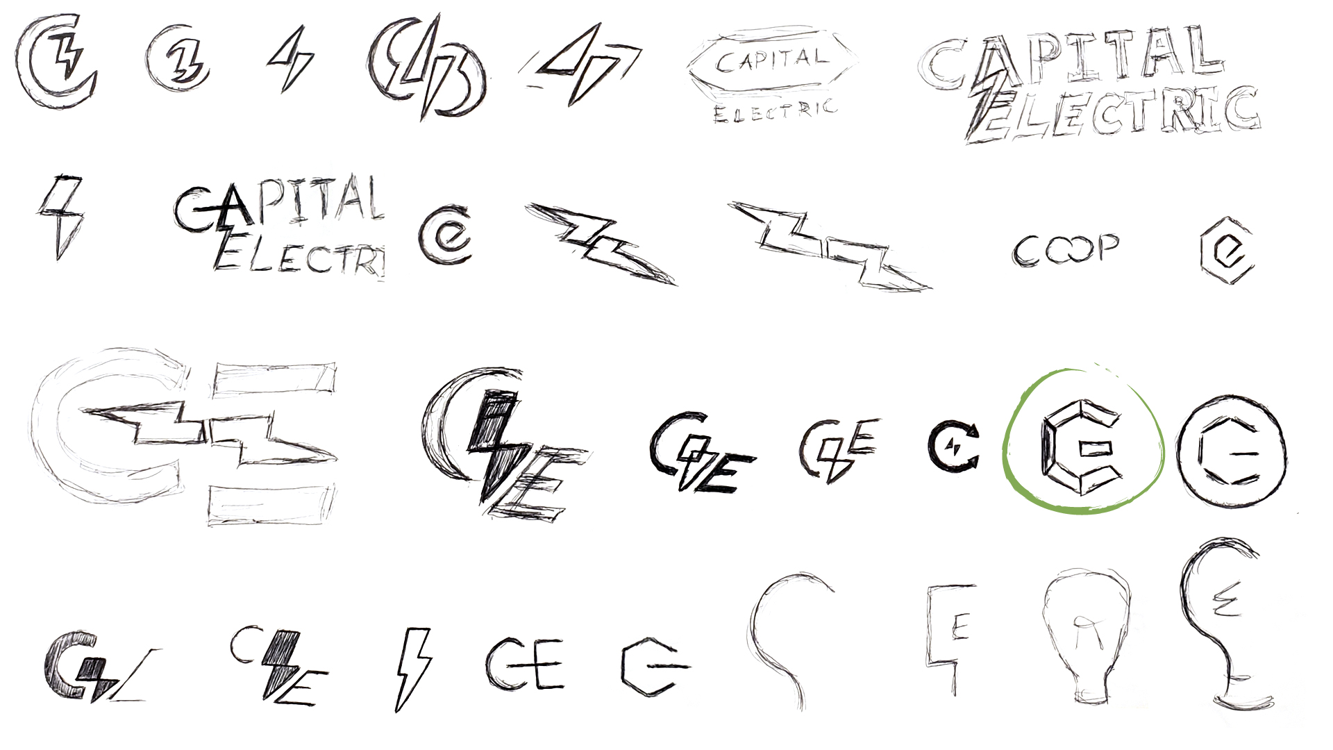
With the approved persona in hand and a deep understanding of CEC, our creative team developed three logo concepts, each focusing on a different set of characteristics, all of equal importance to the brands’ personality. The selected logo was tweaked and finalized along with a brand standards’ guide for the CEC team to easily adopt and implement the new brand identity.
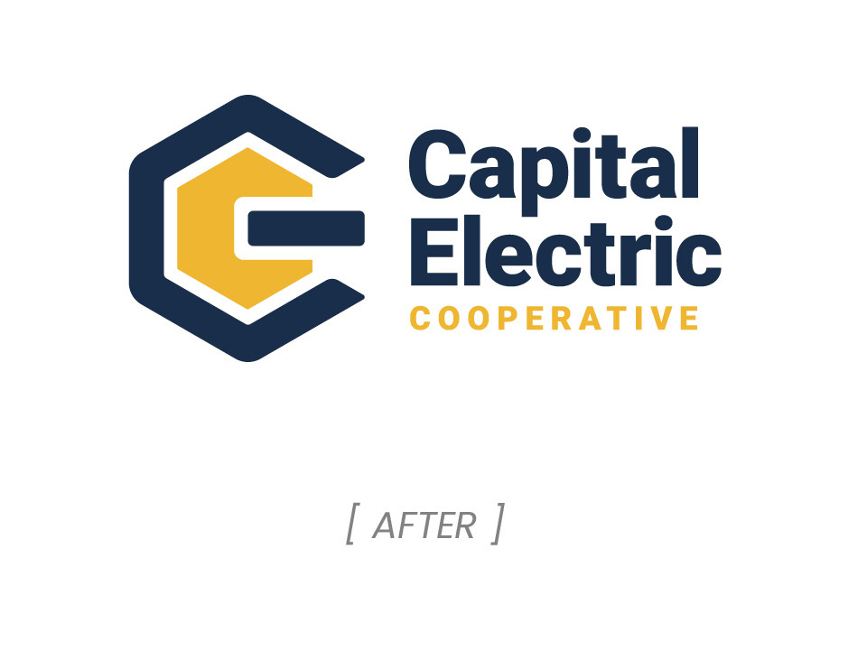
The angular, wrench-like shape to the logo mark represents CEC’s hands-on attitude, while creatively displaying the CEC acronym the community was so familiar with. A close cousin to the classic power button icon, the mark uses a modern interpretation of energy for a subtle nod to their business at its core – keeping the power on.


